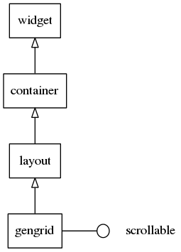
Gengrid Container
Gengrid container is based on the same idea as the genlist. It aims at displaying objects on a grid layout and rendering only the visible ones. As for the genlist, callbacks are called at item creation or deletion.
This container inherits from the layout widget and implements the scroller interface. Thus scroller and layout functions can be used with this widget.
A gengrid may display its items using horizontal or vertical layout. In the first layout, items are displayed in columns from top to bottom, starting a new column when the space for the current column is filled. In the second one, items are set in rows from left to right.
Table of Contents
Related Info
Adding a Gengrid
To add a gengrid widget:
Evas_Object *gengrid = elm_gengrid_add(parent);
Gengrid Items
A gengrid item is composed of 0 or more texts, 0 or more contents and 0 or more boolean states. The number of the text and content depends on the theme used for gengrid items. For the default gengrid item theme, we have one text part (“elm.text”), two content parts (“elm.swallow.icon” and “elm.swallow.end”) and no state parts.
Creating and Deleting Items
As with genlists, items are allocated and deleted on the go, while the user is
scrolling the gengrid. Here we declare a Elm_Gengrid_Item_Class structure to
inform the gengrid how to manage items.
static Elm_Gengrid_Item_Class *gic = elm_gengrid_item_class_new();
gic->item_style = "default";
gic->func.text_get = _grid_label_get;
gic->func.content_get = _grid_content_get;
gic->func.state_get = _grid_state_get;
gic->func.del = _grid_del;
The parameters of this structure will not be detailed here, because they are very similar to that of the genlist. Please refer to the genlist widget page for more detailed information.
Managing Items
As with genlists, items can be added with the elm_gengrid_item_append(),
elm_gengrid_item_prepend(), elm_gengrid_item_insert_before() and
elm_gengrid_item_insert_after() functions. With the gengrid, there is no need
to pass the “type” parameters. They can be cleared with the
elm_gengrid_clear() function.
We can set the multiselection mode on.
elm_gengrid_multi_select_set(gengrid, EINA_TRUE);
When this mode is on, selected items are retrieved with
elm_gengrid_selected_items_get(). It returns a list of all the selected items.
When the content of an item changes, we can call elm_gengrid_item_update() to
ask the gengrid to update this item's content.
We can also manually select or disable some items with
elm_gengrid_item_selected_set() and elm_object_item_disabled_set().
Using Gengrid Callbacks
The gengrid widget emits the following signals:
“activated”- The user has double-clicked or pressed (enter | return | spacebar) on an item. The event_info parameter is the gengrid item that is activated.“clicked,double”- The user has double-clicked an item. The event_info parameter is the gengrid item that is double-clicked.“longpressed”- The item is pressed for a certain amount of time. By default it is one second.“selected”- The user has selected an item. The event_info parameter is the gengrid item that is selected.“unselected”- The user has unselected an item. The event_info parameter is the gengrid item that is unselected.“realized”- The item in the gengrid has its implementing Evas object instantiated, de facto. event_info is the gengrid item that is created. The object may be deleted at any time, so it is strongly advisable not to use the object pointer returned from elm_gengrid_item_object_get(), because it may point to freed objects.“unrealized”- The implementing Evas object for this item is deleted. event_info is the gengrid item that is deleted.“changed”- An item is added, removed, resized or moved and the gengrid is resized or has “horizontal” property changes.“scroll,anim,start”- Scrolling animation starts.“scroll,anim,stop”- Scrolling animation stops.“drag,start,up”- The item in the gengrid is dragged (not scrolled) up.“drag,start,down”- The item in the gengrid has dragged (not scrolled) down.“drag,start,left”- The item in the gengrid is dragged (not scrolled) left.“drag,start,right”- The item in the gengrid is dragged (not scrolled) right.“drag,stop”- The item in the gengrid stops being dragged.“drag”- The item in the gengrid is dragged.“scroll”- The content is scrolled (moved).“scroll,drag,start”- Dragging the content starts.“scroll,drag,stop”- Dragging the content stops.“edge,top”- The gengrid is scrolled to the top edge.“edge,bottom”- The gengrid is scrolled to the bottom edge.“edge,left”- The gengrid is scrolled to the left edge.“edge,right”- The gengrid is scrolled to the right edge.

