Table of Contents
Scalability Using Edje
Edje provides an abstraction layer between the application code and the interface. You can use Edje in your EFL applications to create visual elements and control the layout, look, and feel.
Internally, Edje holds a geometry state machine and a state graph that defines, for example, what is visible, where, at what size, and with what colors. These details are described to Edje using an Edje .edj file. The file can be produced by using Edje_cc to take a text file (a .edc file) and “compile” an output .edj file that contains the state graph information, images, and any other needed data.
While creating Edje, you set specific element properties to control the scalable behavior of the UI. Before creating a scalable UI using Edje, you must be familiar with the following scalability properties and part types.
Table of Contents
Part
Parts are used to represent the most basic layout elements, such as a line in a border or a text on an image.
The parts can have the following property:
- scale: 0-1
Specifies whether the part scales its size with the scaling factor. This property is used to scale properties, such as font size or min/max size of the part.
The default value is 0 (off) and the default scaling factor is 1.0. To make a part scalable, set the property to 1 (on).
Description
Every part can have one or more description blocks to define the layout properties of the part.
The descriptions can have the following properties:
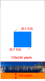
min/max: width height
Specifies the minimum or maximum size of the part in pixels. It has no effect on the container size.
When thescaleproperty of the part is set to 1 (on), the size is multiplied by the scaling factor.
fixed: 0-1 0-1
When theminormaxproperty is set, this property sets a boolean value for each dimension (horizontal and vertical, respectively) that tells the application whether it must be scaled when resized.
The default value is0 0. To fix a part size to its min or max, set the value to 1.
align: X-axis Y-axis
When the displayed object size is smaller than its container, this property moves it along both axes using the relative position.
To move the property, use x = 0.0 to move to left, x = 1.0 to move to right, y = 0.0 to move to the top, and y = 1.0 to move to the bottom. The x = 0.5, y = 0.5 value sets the object at the center of its container.
The default value is0.5 0.5.
rel1/rel2
Specifies the position of the left-top and bottom-right corners of the part's container.- relative: X-axis Y-axis
Specifies the relative position of the part's container.
The default value is 0.0 0.0 for rel1.relative and 1.0 1.0 for rel2.relative. to/to_x/to_y
Specified that a corner must be positioned relatively to another part's container.
By default, the corners of a part are placed to the whole interface.
aspect: min max
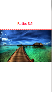
Specifies the width to height ratio to keep when the part is resized. When both values are the same, the ratio is fixed. When they differ, the part is forced to keep the ratio between theminandmaxproperties when resized.
The default value is0.0 0.0.
aspect_preference: dimension
Specifies the scope of theaspectproperty to a given dimension.
The possible values areBOTH,VERTICAL,HORIZONTAL, andNONE. The default isNONE.
Text
The text elements are used to display text on the screen.
The texts can have the following properties:
size: font-size
Specifies the font size for the text. When thescaleproperty of the part is set to 1 (on), the size is multiplied by the scaling factor.
min: horizontal vertical
Specifies a pair of boolean values that define whether the container can be reduced further than the text size. The property is used to prevent the container from chopping the text.
Whenminis set horizontally or vertically, the minimum height or width of the part is decided by the text size.
The default value is0 0.
max: horizontal vertical
Specifies a pair of boolean values that define whether the container can be expanded further than the text size.
Whenmaxis set horizontally or vertically, the maximum height or width of the part is decided by the text size.
The default value is0 0.
fit: horizontal vertical
Specifies a pair of values that define whether the text is scaled to fill its container horizontally and/or vertically.
The default value is0 0.
Image
The image elements are used to display images on the screen.
The images can have the following properties:
border: left right top bottom
Specifies the border size of the image in pixels. This property sets the area of each side of the image to be displayed as a fixed size border, preventing the corners from being changed on a resize.
border_scale
Specifies whether the border scales its size according to the scaling factor.
The default value is 0 (off). To make the border scalable, the value must be set to 1 (on).
Image Set
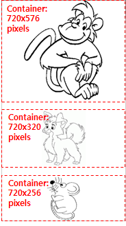
The image set elements are used to display a specific image on the screen based on the container size.
The image sets can have the following properties:
name: image-name
Specifies the name of the image file.
size: minw minh maxw maxh
Specifies the minimum and maximum size that causes a specified image to be
selected and shown.
The image set is used to control resource quality when the image part is scaled to multiple devices. According to the size of the part's container, an appropriate image is loaded.
Part Types
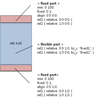
You can use fixed and flexible parts:
- Fixed parts
- Fixed parts have a minimum size (at least width or height).
- When the part
scaleproperty is set to 1 (on), the scaling factor has an effect on the minimum size. - Fixed parts are used when the parts must keep a fixed size in any device or any orientation.
- Flexible parts
- Flexible parts resize according to the container size and other fixed parts' size.
- Flexible parts are used when the parts can be resized in any device or any orientation.


