Scalability using Elementary UI components
Elementary includes an extensive set of UI components. You can use elementary UI components to compose your application user interface (UI). While creating the UI, you can set specific properties for the UI components to control the scalable behavior of the UI. Before you try to create a scalable UI using elementary UI components, make sure you understand the following core concepts on how scalability works with elementary UI components.
- Infrastructure: to control the behavior of elementary.
- Container: UI components that can contain other UI components.
- UI components: elementary UI components, such as buttons, lists, and check and radio boxes.
Table of Contents
Using Containers for Effective Layouts
The Elementary library provides several containers to display UI components in an effective layout. The containers have no visual identity of their own.
Box
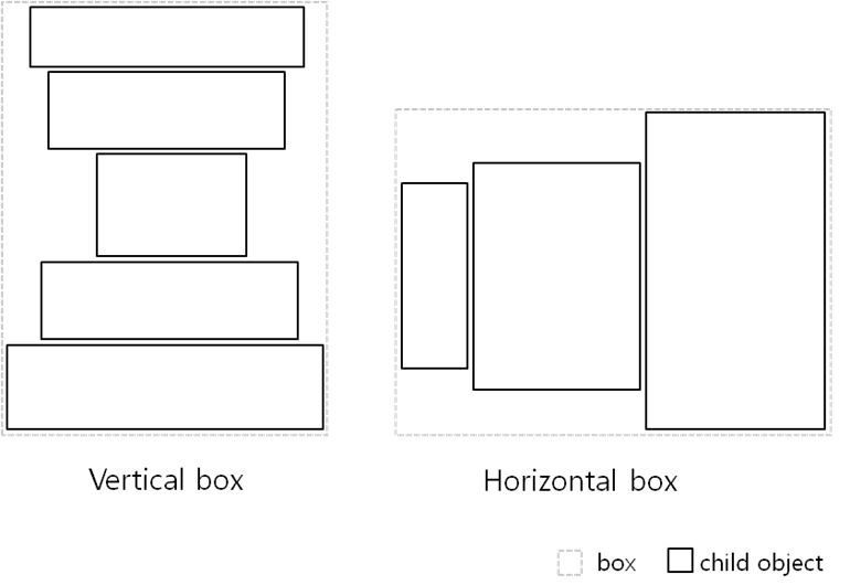
The box container makes a layout where child UI components are stacked in either horizontal or vertical direction. The box size is the sum of its child UI components' size:
- A vertical box calculates its height as the sum of its children's height and its width as the width of the widest child.
- A horizontal box calculates its width as the sum of its children's width and its height as the height of the tallest child.
The box-based linear layout is the best solution to ensure a minimum size for the child UI components in any device or any orientation.
Grid
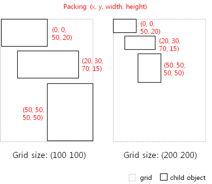
The grid container makes a layout where child UI components set their position and size relative to the container position and size. You can define the virtual width and height of the grid (by default: 100 x 100). You then packs the child UI components into the grid while setting their position and size based on the virtual size of the grid.
The grid-based relative layout can always fill the full screen in any device or any orientation. However, the size of the child UI components is changed based on the screen size.
Using Weight and Align Properties
To make a layout scalable with UI components, the UI components must be packed into a container using only the weight and align properties based on their minimum size. Do not resize the UI components directly using pixels.
The weight and align properties are associated with every elementary UI component, and they serve as hints for the container they are in. They tell the container how the UI component wants to occupy the space and pack itself with other UI components in the container.
Weight
You can set the weight property with the
evas_object_size_hint_weight_set(x_weight, y_weight) function:
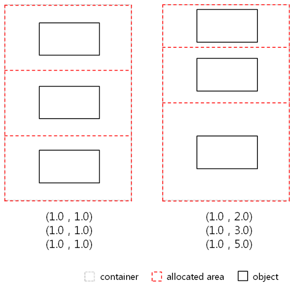
- Containers use the weights of the child UI components by normalizing them across all child UI components along both X and Y directions.
- The parameter values can be 0 or positive values (default: 0.0).
0.0 means that the container allocates a minimum size of the UI component area.
1.0 (EVAS_HINT_EXPAND) means that the container allocates all of the remaining
area to the UI component.
- If the container has several UI components, it allocates the UI component area relative to the weights of other UI components.
Weight hint__: Weight hint across multiple child UI components__:
Align
You can set the align property with the
evas_object_size_hint_align_set(x_align, y_align) function:
- UI components use the alignment for their position or size along both X and Y directions.
- The parameter values can be from 0.0 to 1.0 or -1.0 (default: 0.5).
- The values define positions as follows: left is (x=0.0), right is (x=1.0), top is (y=0.0), and bottom is (y=1.0). The center is (x=0.5, y=0.5).
-1.0 (EVAS_HINT_FILL) means that the UI component fills all of the allocated area.


